If dads are being included in the parenting space, where can they change their babies when out in public? Public restrooms still lack inclusivity when it comes to having accessible changing tables in men's rooms.
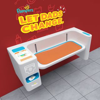
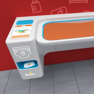
A pampers-branded diaper changing station with the words 'Let dads change' written on the wall above it. A close-up shot of one half of the diaper changing station, showing an integrated touch screen with a keyboard and the words 'Find products'

We redesigned the dreaded old school changing table and brought it into the tech-first century. The smart table integrates with the revamped Pampers' app to allow easy shopping for those 'oops' moments, moms and dads know too well.
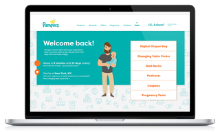
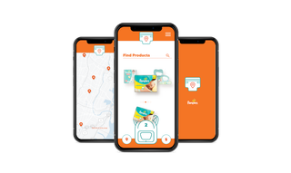
A computer with a re-designed Pampers website open. The site shows a cartoon graphic of a father holding a baby next to various buttons and information, including a button that says 'Find a changing table in your area' A row of 3 phones with a re-designed Pampers app open on them. The first phone has a map which shows changing table locations. The second phone shows a search page for finding Pampers products. The third phone shows a loading screen.

The Pampers app and site are now more inclusive and dad-friendly. The app partners with target stores that have the smart changing table, allowing easy use of product pickup in-store.

A set of 10 'dadmojis' for various common reactions. Each emoji features a man with a beard and glasses making an expression including smiling, throwing up, crying, and looking angry.

Dadmojis were added to giphy as customizable and relatable icons.
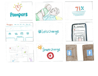
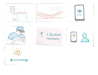
Some storyboard sketches for the Pampers case study video below More storyboard sketches for the Pampers case study video below

D Show Student Award, 2018.

Case study script, animation, copywriting, and strategy created by me.

Credits: Casey O'Brien for live footage, social media, and strategy | Reed Nowels for character design, app design, and web design.